For the Layout (LO) below I used 2 pages from the Wildly Flowering DSP (Designer Series Paper) 12×12 paper, the Cloud Punch (for the snowballs) in the Clearance section, Frosted Forest Bundle for the tree die (cut a 12×12 white card stock in half, die cut by flipping the die over on about 2″ up on each end -see video), and the tree stamp for the post of the “Snowballs for Sale!!” sign. I used the Filled with Cheer stamp set and the Blender pen to color with Cherry Cobbler Ink Pad, Daffodil Delight Ink Pad, Old Olive Ink Pad, Boho Blue (or Balmy Blue) Ink Pad, Moody Mauve Ink Pad, Basic Black Blends to color the melting snowman.
For the LO below, I used a 12×12 Basic White for the base and the DSP are all from Regal Winter DSP paper pack. Berry Burst, Shaded Spruce, Wild Wheat, Boho Blue card stock plus some of the DSP for the circle punches in various sizes. Regal Flora is the stamp and die bundle used for the flower cluster and the die cut for the page title. For the die cut label I cut a Berry Burst and a white then switched the pieces so one is outlined in white and one in Berry Burst and vice versa.
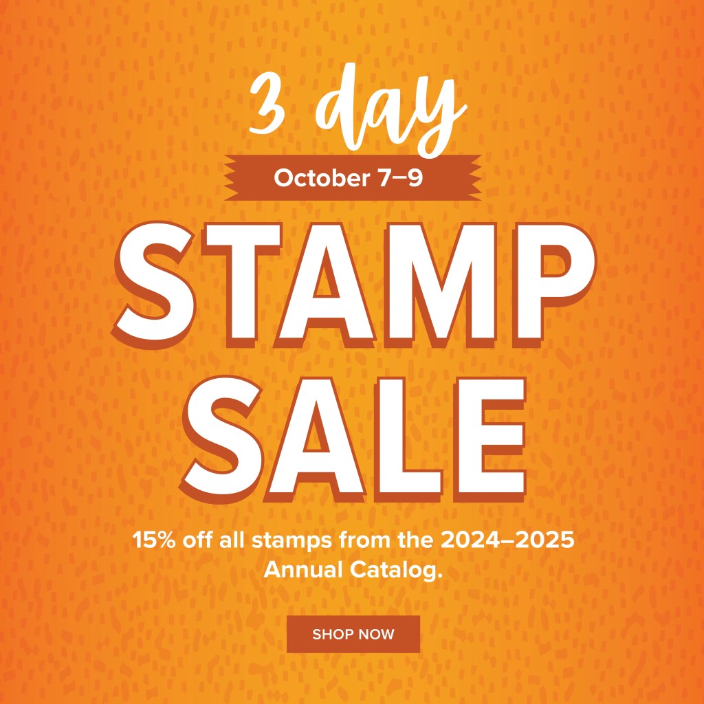
Save 15% on all stamp sets (photopolymer and cling) from the 2024–2025 Annual Catalog for 3 days, October 7-9. How awesome! This discount applies to qualifying stamp sets on customer, demonstrator, workshop, online, and Starter Kit orders. Click here for shopping online and plan your purchase(s). Bundles are not included in this sale.
But wait, there’s more…
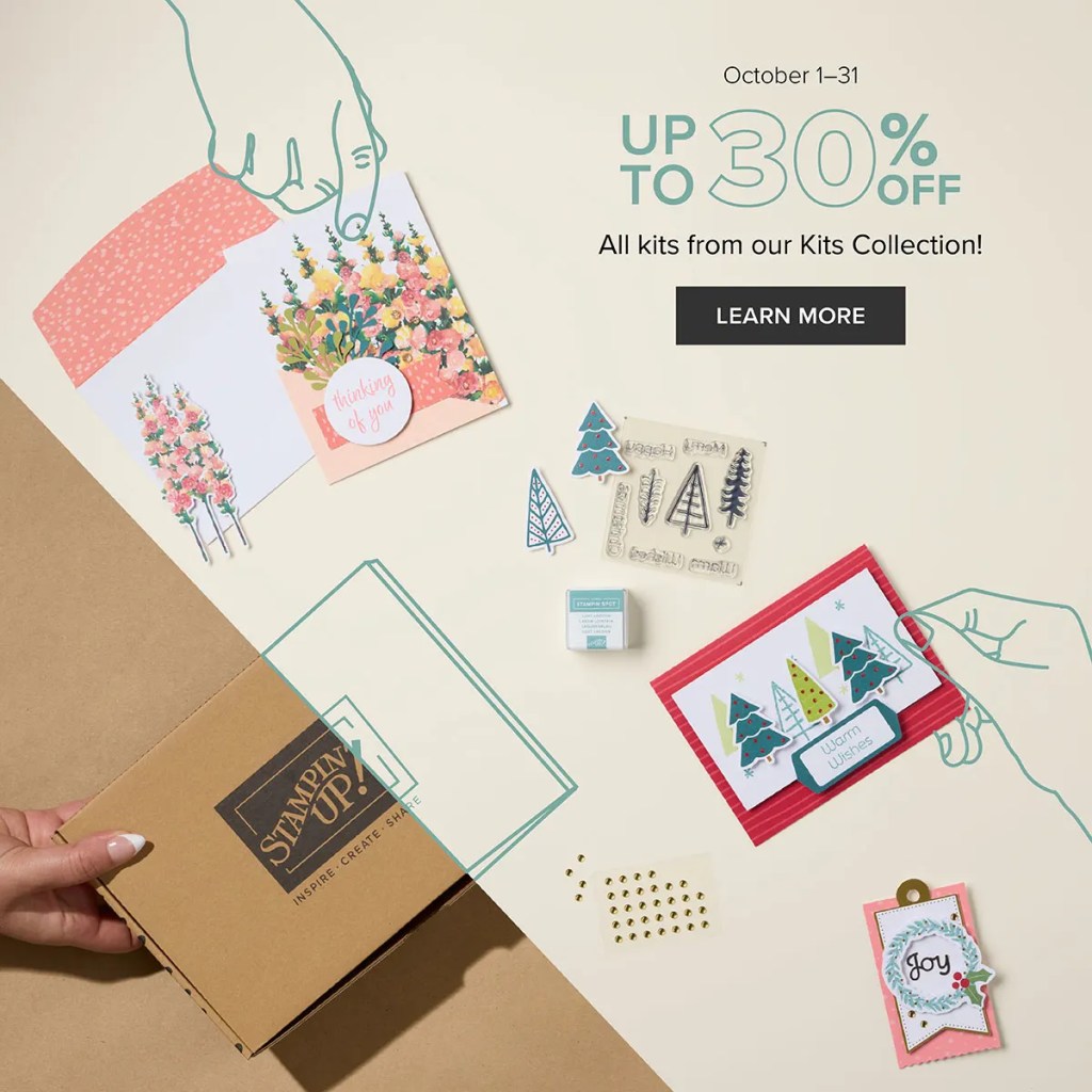
Kits Collection October Sale
Save up to 30% off on all your favorite Kits Collection kits October 1–31! Our kits come with everything you need to create. Click here and scroll down for more details. And thank you to all who signed up and registered for my October Kit Together event! I’m looking forward to the fun.
Here are two brand new kits (on sale, too)…
But wait, there’s more…
Join my team now and get MORE…
Be sure to contact me if you need or want more information on any of the offerings listed above. Have a truly stupendous weekend.
What IS a Memory Keeper? Really it’s a scrapbooker but things always need to be fancy, hehe (or maybe it’s a secret code!!
I have kept a scrapbook since I was in college many, many long years ago. Back then it was just a 12×17 spiral bound book I got at some store and I filled it with all the bits and bobs of my life in college. It was fun, wasn’t anything really pretty but they did tell the story of my college years and I valued them. Then later in life I made digital scrapbooks. They were nice, they really were and again I loved them but they didn’t have a lot of LIFE!! Ok, they told of my life but it was a page and look at, maybe read the journaling but then on to the next page. BUT I’ve found something in between and absolutely love it. It’s paper journaling much like what I did in college but it’s got lots of colored papers, real design and moving parts and pieces. Makes the digital scrapping kind of boring…though I loved it at the time.
The good news about all this is that Stampin’ Up is really starting to get scrapbooking going again. We’ve got kits (if you need a quick scrapbook layout – a12x12 page 2-page spread) but there’s also much more!! We’re starting to see a lot of stamps made specifically for scrapbooking as opposed to card making which means they’re larger.
So the even better news is that I will start doing scrapbooking classes more often. We will do them at least twice a month. One workshop class will be with kits that we can put together as a group, visit, have fun and create either with or without your photos. The other workshop class will also be as a group, visit and have fun but we’ll be working on a spread together from scratch (using a layout). Both workshops classes will be FUN, CREATIVE and PRODUCTIVE!!
If you’re ready to do it leave a comment below or email me and I’ll let you know what and when. The first workshop class will be during Christmas break when I’m home (or if you’re ready to start now I’ll do a couple of on-line classes)…just let me know.
Thank you! And here we are into the holidays…Halloween, Thanksgiving, Christmas, New Years!! Wow, time goes so fast! Let’s keep those memories and the photos we take!
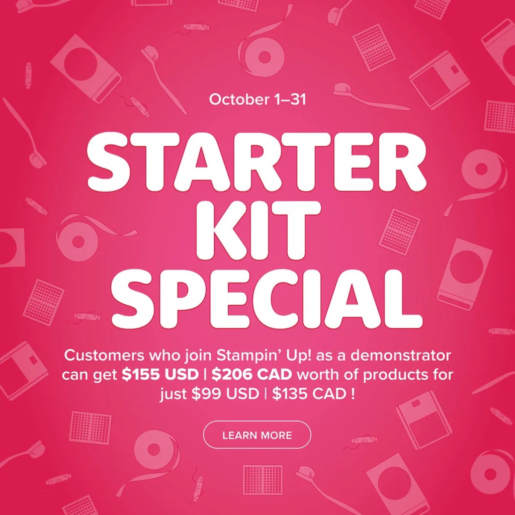
Stampin’ Up is giving us a wonderful starter kit opportunity. You get to choose what items you want to include in your kit. You can choose $155 worth of product (including kits which are on sale this month) and only pay $99 plus tax, shipping is FREE and you’ll get a FREE Paper Pumpkin kit, plus all the supplies you’ll need to start your business if you choose to do that. You can just buy the starter kit even if all you want it 20% off on your crafting supplies.
So, all that being said, what do you have to do after you buy your kit? Not a thing, if that’s your choice BUT if you want to make a business you can do that, too! I love having a small (or big) business, teaching classes, and sharing what I make. Entirely up to you. I’ll help you figure it all out. I’m about to start my 5th year. Let me know what you need and we’ll get your business going. You’ve got until October 31st to make up your mind to get this deal.
What are the questions you have? Leave a comment below!
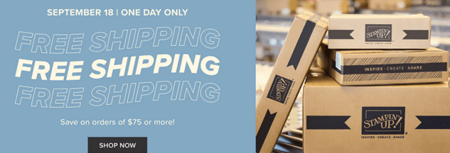
Remember today is FREE shipping day! 24-hours only so just a few hours left!
Remember also that if you order a 6-month or 12-month subscription to Paper Pumpkin you can get it for FREE shipping today only! It’s an amazing offer!
I’ve got a new digital mini for you…link below and always easily found in the sidebar to the right (if your on a computer or scroll all the way to the bottom if you’re on a phone).
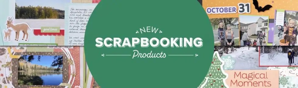
Meet the September 2024 Scrapbooking Brochure—full of scrapbooking products that coordinate with the mini catalog and some online-only suites! Stickers, Two-Toned Cardstock, and Workshop Kits are the first items in this new line. But this is just the beginning. How fun is that! So, stay tuned for more to come in the coming months. View the brochure online and shop these products in my online store.
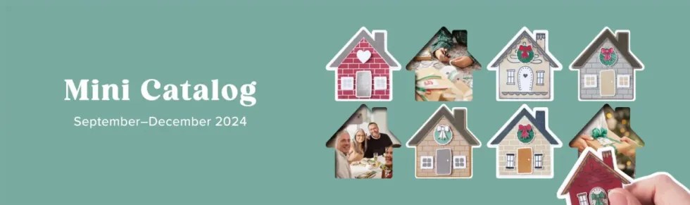
You can also see a digital version of the September to December Mini just released this week here.
Still have a few questions about color theory and color coordination in crafting? You’re not alone! Check out the quick and easy answers to some of the most frequently asked questions on the subject.
Q: What is color theory, and why is it important in crafting?
A: Color theory is the study of how colors work together and how they affect the people who experience them. It’s important in crafting because color is a communication tool—a critical and unique part of the story you’re telling in any crafting or scrapbooking project!
Q: How do I choose a color palette for my scrapbooking project?
A: Choosing a color palette for your scrapbooking project can be fairly simple. First, look at the photos you want to include on the page and consider the colors in those images. Then, ask yourself what your project’s overall message is. Next, find a main color that supports that message and works well with your photos. Third, use the color wheel and the techniques laid out above to choose a palette to support it!
Q: What are the best color combinations for making handmade cards?
A: The best color combinations follow the color theory guidelines we’ve discussed previously, and best express the message you’re trying to send. Finding monochromatic, analogous, complementary, or triadic colors that speak to you and the receiver of your handmade card will always make your card design a hit!
Q: How can I effectively mix and match colors in DIY crafting kits?
A: Most DIY crafting kits, like the ones you’ll find at Stampin’ Up!, are designed to contain elements within a particular color family or palette already, making it incredibly easy to mix and match the supplies provided within. One tip, however, is to go back to what you learned about the color wheel. For example, if you have a ribbon from a separate kit that will work nicely in a monochromatic, analogous, complementary, or triadic way, don’t be afraid to bring it into the mix!
Q: What are some general tips for coordinating colors in handmade projects?
A: General tips for coordinating colors in handmade projects include using the four color schemes we learned about above. A simple starting point is to choose a color you love and then find other elements (paper, ink, markers, ribbons, etc.) of the same color but of varying saturation—thus creating a monochromatic color palette for your project.
Q: Where can I find color inspiration for my next crafting project?
A: Inspiration can come from many places, but we love seeking inspiration from nature—especially when it comes to finding the best color combinations. It’s also smart to look at the work of experienced crafters (try finding talented cardmakers who create in a style you enjoy on Instagram, for instance) and the professionals. Check out the Stampin’ Up! annual catalog and our Instagram or Pinterest account for plenty of color inspiration as well.
Q: What quick and easy color combinations work well in crafts?
A: Quick and easy color combinations are plentiful! Here are a few we love and that work for any number of crafts, occasions, or moods!
Turquoise + peach + violet
Fuschia + yellow-green
Bright red + hot pink
Royal blue + golden yellow
Yellow + pink + green
Be sure to refer to our Stampin’ Up! color wheel for more color combos (there’s one in the current Annual Catalog).
Get Creative With Color Coordinating in Crafts
Now that we’ve simplified color theory and color coordination in crafts, it’s time for you to get creative! What color combinations are you excited to try? Still looking for more card design inspiration? Ready to shop for perfectly coordinated colors of paper, ink, and other scrapbooking supplies? Shop or connect with me as a Stampin’ Up! Demonstrator today!
One of our favorite tips for color-coordinating in crafts is to look to nature. When in doubt, look at how colors appear in the natural world—it’s hard to go wrong by applying this advice to a craft project. You may be surprised to see how often the color combinations you come across on a walk or while looking through outdoor vacation photos align with what you’ve learned about color theory and the color wheel so far.
Take, for example, the lilacs that bloom in the springtime. The naturally occurring fuschia shades are directly across the wheel from the color found in their bright green leaves! Try this with other flowers, vistas, and even animals—you’ll soon understand why so many artists love and find inspiration in the great outdoors.
Another simple trick for how to coordinate colors in crafting is to look for inspiration online. Plenty of crafters and artists love to share their work and we get to benefit from it. A quick search for pretty color combinations on Pinterest or checking out relevant hashtags on Instagram can give you tons of color inspiration for scrapbooking and cardmaking.
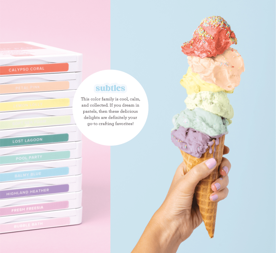
Our last, and maybe most helpful, hack for coordinating colors in crafting is to use the color wheel created by Stampin’ Up! for this exact purpose. Think of it as a cheat sheet that reveals innumerable color combinations that perfectly align with the products you already own or can easily shop for after falling in love with a particular palette. Incorporating all our color collections—Brights, Neutrals, Regals, and Subtles—the Stampin’ Up! color wheel follows the same rules as the original but with more dynamic and plentiful results.
Explore it using the rules you learned about monochromatic, analogous, complementary, and triadic colors to find unexpected new color combinations for your next crafting project!
Crafting with Color: Best Practices and Combinations
Stampin’ Up! has made it super easy to use best practices when it comes to color coordination in crafting. Because the best color combinations in scrapbooking follow color theory guidelines, we have created color families that perfectly coordinate no matter the occasion.
Consider our Subtles line—it’s a combination of calming colors that still breathe a little life and joy into whatever sentiment you want to capture in your project.
Utilizing Step-by-Step Stampin’ Up! kits is another great way to produce a variety of crafts and scrapbooking projects with purposefully complementary elements every time. This is a great option for beginners who don’t yet feel confident in their ability to find the best color combos or for the busy maker who enjoys the convenience of well-thought-out supplies and materials. This Love This Memory Notebook Kit is a great example!
Our best advice when it comes to crafting with color? Experiment! Playing around with color combinations that speak to you or whoever else you may be creating for is one of the best parts of the creative process. This often leads to the production of unique and heartfelt creations that wouldn’t exist without the joy of your own discovery.
Check back tomorrow for: Frequently Asked Questions: Color Coordinating in Crafts and Scrapbooking
There are several ways to look at and utilize the color wheel for color coordination. For example, you’ll notice that the wheel above can be split in half between the violet and fuschia, then across the wheel, and down between the yellow and green wedges. That will effectively divide the wheel into what are known as the warm (upper right) and cool colors (lower left). If you cover the warm colors now using a piece of paper or your hand, can you see how all those cool colors look as though they belong in a family? This means that they can play well together as good color combos in scrapbooking and paper crafting.
But the possibilities don’t end with simply warm and cool color families. Let’s talk about how to find and use monochromatic, complementary, analogous, and triadic colors in your cardmaking. Here are some examples from the Stampin’ Up! Annual Catalog:
Monochromatic Colors
Monochromatic colors are one of the easiest to work with in crafting projects. To start a monochromatic card design, simply choose a color you love from the color wheel and then pair it with another shade or tint of the same color that’s a bit darker or lighter (or both!). This color coordination technique makes for perfectly matching paper projects every time, plus it comes across as chic and tastefully understated.
Analogous Colors
Ready to drift a little further from the single-hued design of monochromatic colors? Try analogous colors, which are found by combining one color with its closest neighbors on the color wheel. By choosing analogous colors for your card, you’re ensuring a look of cohesion and harmony, as these combinations are known for their calming effect in artistic design.
Complementary Colors
Complementary colors are the first ones that offer a real pop in art and design. While you find them in directly opposite positions from one another on the color wheel, these color pairings prove that opposites attract. They brighten each other’s effect in bold but friendly contrast. Complementary colors add energy and vibrancy to any crafting project.
Triadic Colors
Triadic color schemes are found by finding three colors equally spaced apart on the color wheel. These color combinations can feel just as predictable (think the primary colors of red, yellow, and blue) as they do dynamic or unexpected. If you think of the color wheel as a dial, find a triadic color combination you like by shifting the dial one click at a time away from those primary hues. Then, it’s a good idea to pick a predominant color while letting the other two play important supporting roles in your card design.
Check back tomorrow for Practical Tips for Color Coordinating Your Crafts