Frequently Asked Questions: Color Coordinating in Crafts and Scrapbooking

Still have a few questions about color theory and color coordination in crafting? You’re not alone! Check out the quick and easy answers to some of the most frequently asked questions on the subject.

Q: What is color theory, and why is it important in crafting?

A: Color theory is the study of how colors work together and how they affect the people who experience them. It’s important in crafting because color is a communication tool—a critical and unique part of the story you’re telling in any crafting or scrapbooking project!

Q: How do I choose a color palette for my scrapbooking project?

A: Choosing a color palette for your scrapbooking project can be fairly simple. First, look at the photos you want to include on the page and consider the colors in those images. Then, ask yourself what your project’s overall message is. Next, find a main color that supports that message and works well with your photos. Third, use the color wheel and the techniques laid out above to choose a palette to support it!

Q: What are the best color combinations for making handmade cards?

A: The best color combinations follow the color theory guidelines we’ve discussed previously, and best express the message you’re trying to send. Finding monochromatic, analogous, complementary, or triadic colors that speak to you and the receiver of your handmade card will always make your card design a hit!

Q: How can I effectively mix and match colors in DIY crafting kits?

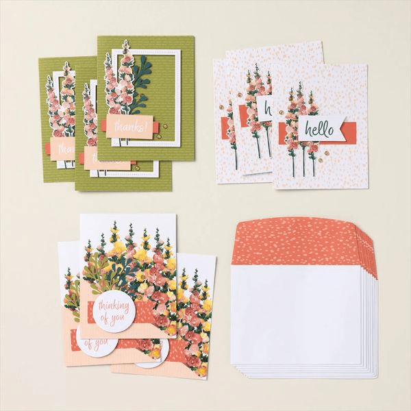
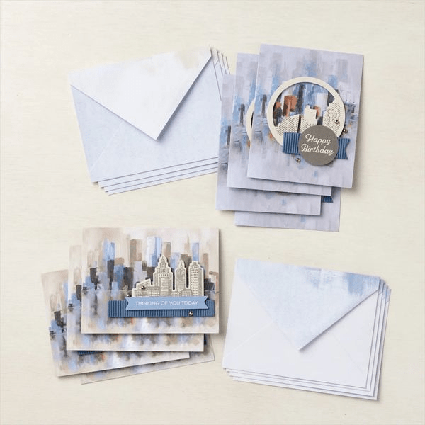
A: Most DIY crafting kits, like the ones you’ll find at Stampin’ Up!, are designed to contain elements within a particular color family or palette already, making it incredibly easy to mix and match the supplies provided within. One tip, however, is to go back to what you learned about the color wheel. For example, if you have a ribbon from a separate kit that will work nicely in a monochromatic, analogous, complementary, or triadic way, don’t be afraid to bring it into the mix!

Q: What are some general tips for coordinating colors in handmade projects?

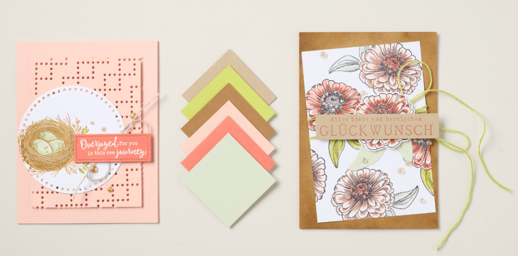
A: General tips for coordinating colors in handmade projects include using the four color schemes we learned about above. A simple starting point is to choose a color you love and then find other elements (paper, ink, markers, ribbons, etc.) of the same color but of varying saturation—thus creating a monochromatic color palette for your project.

Q: Where can I find color inspiration for my next crafting project?

A: Inspiration can come from many places, but we love seeking inspiration from nature—especially when it comes to finding the best color combinations. It’s also smart to look at the work of experienced crafters (try finding talented cardmakers who create in a style you enjoy on Instagram, for instance) and the professionals. Check out the Stampin’ Up! annual catalog and our Instagram or Pinterest account for plenty of color inspiration as well.

Q: What quick and easy color combinations work well in crafts?

A: Quick and easy color combinations are plentiful! Here are a few we love and that work for any number of crafts, occasions, or moods!

  • Turquoise + peach + violet
  • Fuschia + yellow-green
  • Bright red + hot pink
  • Royal blue + golden yellow
  • Yellow + pink + green

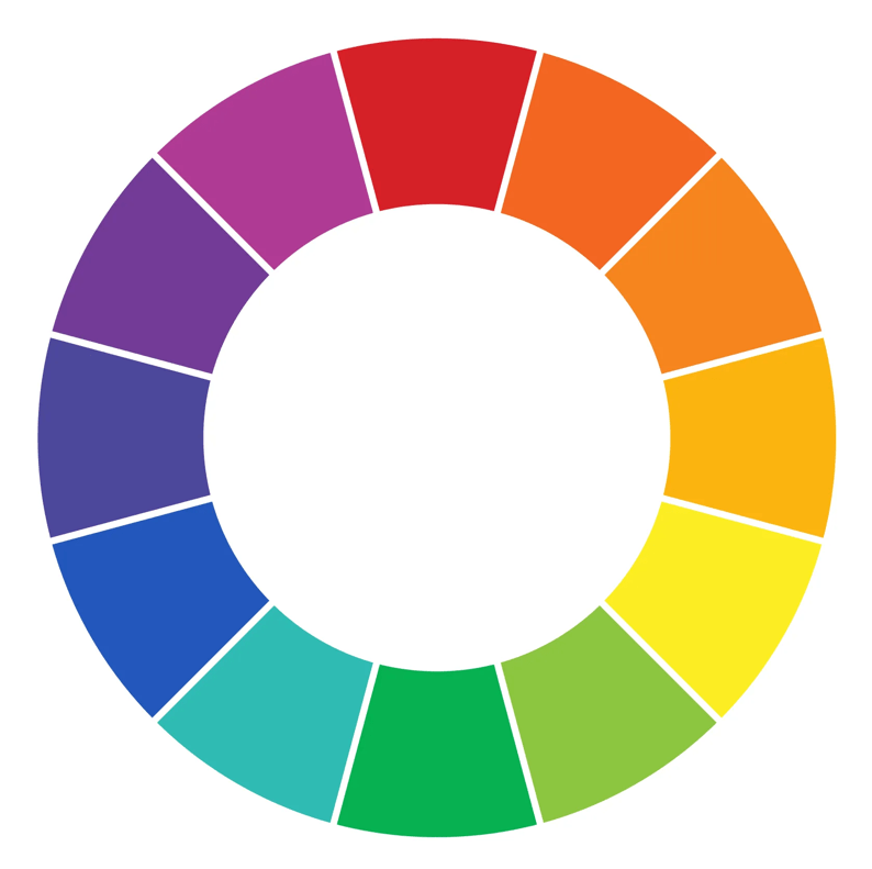
Be sure to refer to our Stampin’ Up! color wheel for more color combos (there’s one in the current Annual Catalog).

Get Creative With Color Coordinating in Crafts

Now that we’ve simplified color theory and color coordination in crafts, it’s time for you to get creative! What color combinations are you excited to try? Still looking for more card design inspiration? Ready to shop for perfectly coordinated colors of paper, ink, and other scrapbooking supplies? Shop or connect with me as a Stampin’ Up! Demonstrator today!

Practical Tips for Color Coordinating Your Crafts

One of our favorite tips for color-coordinating in crafts is to look to nature. When in doubt, look at how colors appear in the natural world—it’s hard to go wrong by applying this advice to a craft project. You may be surprised to see how often the color combinations you come across on a walk or while looking through outdoor vacation photos align with what you’ve learned about color theory and the color wheel so far. 

Take, for example, the lilacs that bloom in the springtime. The naturally occurring fuschia shades are directly across the wheel from the color found in their bright green leaves! Try this with other flowers, vistas, and even animals—you’ll soon understand why so many artists love and find inspiration in the great outdoors.

Another simple trick for how to coordinate colors in crafting is to look for inspiration online. Plenty of crafters and artists love to share their work and we get to benefit from it. A quick search for pretty color combinations on Pinterest or checking out relevant hashtags on Instagram can give you tons of color inspiration for scrapbooking and cardmaking.

Our last, and maybe most helpful, hack for coordinating colors in crafting is to use the color wheel created by Stampin’ Up! for this exact purpose. Think of it as a cheat sheet that reveals innumerable color combinations that perfectly align with the products you already own or can easily shop for after falling in love with a particular palette. Incorporating all our color collections—Brights, Neutrals, Regals, and Subtles—the Stampin’ Up! color wheel follows the same rules as the original but with more dynamic and plentiful results. 

Explore it using the rules you learned about monochromatic, analogous, complementary, and triadic colors to find unexpected new color combinations for your next crafting project!

Crafting with Color: Best Practices and Combinations

Stampin’ Up! has made it super easy to use best practices when it comes to color coordination in crafting. Because the best color combinations in scrapbooking follow color theory guidelines, we have created color families that perfectly coordinate no matter the occasion. 

Consider our Subtles line—it’s a combination of calming colors that still breathe a little life and joy into whatever sentiment you want to capture in your project.

Utilizing Step-by-Step Stampin’ Up! kits is another great way to produce a variety of crafts and scrapbooking projects with purposefully complementary elements every time. This is a great option for beginners who don’t yet feel confident in their ability to find the best color combos or for the busy maker who enjoys the convenience of well-thought-out supplies and materials. This Love This Memory Notebook Kit is a great example!

Our best advice when it comes to crafting with color? Experiment! Playing around with color combinations that speak to you or whoever else you may be creating for is one of the best parts of the creative process. This often leads to the production of unique and heartfelt creations that wouldn’t exist without the joy of your own discovery.

Check back tomorrow for: Frequently Asked Questions: Color Coordinating in Crafts and Scrapbooking

Color Coordinating Strategies

There are several ways to look at and utilize the color wheel for color coordination. For example, you’ll notice that the wheel above can be split in half between the violet and fuschia, then across the wheel, and down between the yellow and green wedges. That will effectively divide the wheel into what are known as the warm (upper right) and cool colors (lower left). If you cover the warm colors now using a piece of paper or your hand, can you see how all those cool colors look as though they belong in a family? This means that they can play well together as good color combos in scrapbooking and paper crafting.

But the possibilities don’t end with simply warm and cool color families. Let’s talk about how to find and use monochromatic, complementary, analogous, and triadic colors in your cardmaking. Here are some examples from the Stampin’ Up! Annual Catalog:

Monochromatic Colors

Monochromatic colors are one of the easiest to work with in crafting projects. To start a monochromatic card design, simply choose a color you love from the color wheel and then pair it with another shade or tint of the same color that’s a bit darker or lighter (or both!). This color coordination technique makes for perfectly matching paper projects every time, plus it comes across as chic and tastefully understated.

Analogous Colors

Ready to drift a little further from the single-hued design of monochromatic colors? Try analogous colors, which are found by combining one color with its closest neighbors on the color wheel. By choosing analogous colors for your card, you’re ensuring a look of cohesion and harmony, as these combinations are known for their calming effect in artistic design.

Complementary Colors

Complementary colors are the first ones that offer a real pop in art and design. While you find them in directly opposite positions from one another on the color wheel, these color pairings prove that opposites attract. They brighten each other’s effect in bold but friendly contrast. Complementary colors add energy and vibrancy to any crafting project.

Triadic Colors

Triadic color schemes are found by finding three colors equally spaced apart on the color wheel. These color combinations can feel just as predictable (think the primary colors of red, yellow, and blue) as they do dynamic or unexpected. If you think of the color wheel as a dial, find a triadic color combination you like by shifting the dial one click at a time away from those primary hues. Then, it’s a good idea to pick a predominant color while letting the other two play important supporting roles in your card design.

Check back tomorrow for Practical Tips for Color Coordinating Your Crafts

Color Coordinating 101: Everything You Need to Know – Part 1

When you add the word “theory” to any phrase, it can suddenly feel a bit intimidating—like it really requires an in-depth study to truly understand its complexity. Maybe that’s true, but when it comes to color theory and how it relates to color coordination in crafts, we’re here to demystify the topic and make combining colors while cardmaking and scrapbooking as simple as possible.

As defined by the Interaction Design Foundation, “color theory is the study of how colors work together and how they affect our emotions and perceptions. It’s like a toolbox for artists, designers, and creators to help them choose the right colors for their projects.”

What a great toolbox to have when you’re creating beautiful paper sentiments for your loved ones! Let’s dive a little deeper into color theory in crafting, how to work with monochromatic, complementary, analogous, and triadic color schemes and some practical tips for crafting with color. Plus, we’ll reveal the answers to frequently asked questions about color coordinating in crafts and give examples of the best color combos for cards, so make sure to bookmark this page for future reference!

Understanding Color Theory in Crafting

Understanding color theory in crafting means we need to take a closer look at basic color theory as well as the color wheel. Then, we’ll dive into how to use them both in order to find the best color combinations for any craft project you’ve got up your sleeves.

Basic Color Theory

The basis of color theory is the belief that color is important and that individual hues, color values, and saturation levels affect the mood of a visual. That color itself evokes a range of emotions in human beings.

Certain colors just seem to work better in certain scenarios—brights for birthdays and neutrals for condolences, for example. Colors really are an influential communication tool! Many scientific studies have shown that we have a natural emotional response to various hues. So, how does that relate to colors in crafting?

Well, if we understand that red is often a stimulating color associated with energy, power, or passion, we probably won’t choose to use it as a foundational color in a card welcoming a new baby. A color connected to calmness (blue) or joy (yellow) may be a more fitting choice. That said, a nice red could work well in a congratulatory card for a friend who’s recently been promoted. The color better suits the emotions of the situation being celebrated. 

While you can always dive deeper into what each color means in our culture, you can often simply trust your gut. Humans react to colors a certain way because of our scientific makeup, not because we’re told to do so. So, if instinct says that turquoise is the way to go when creating a thinking-of-you card for a specific friend, you’re probably right!

Now, things do get a bit more complex when coordinating colors in crafting. Let’s learn a little more about the color wheel to further our understanding of what good color combos might look like.

The Color Wheel

The color wheel is the perfect tool for figuring out how to mix colors in crafting. But what exactly is it?

The color wheel is a visual diagram that represents the visible spectrum of light. The colors are organized into a wheel where the ‘final’ color meets again with the initial one in a strategic gradient, forming many key visual relationships throughout. Viewing colors like this makes it easy to coordinate colors in crafting as long as you know some important strategies.

Tomorrow I’ll post more on Color Coordinating Strategies!

Bonus Days Starts July 3rd

Bonus Days starts tomorrow! During Bonus Days, when you shop and spend $50 between 3–31 July you will earn a $5 coupon! You can then redeem your coupon (or coupons) between 1–31 August. Your coupon codes will be emailed to you, so make sure all your account information is accurate at checkout. Shop the online store and products from our current catalog, Online Exclusives, Kits Collection, and more!

Are you a Paper Pumpkin subscriber, I know that you love crafty things. Who doesn’t? You also appreciate great value and you’re probably looking for the next best thing to add to your craft collection. So, I wanted to make sure that you’re in the know about our incredible Bonus Days promotion!

Earn coupons by purchasing a 3-, 6-, or 12-month Paper Pumpkin prepaid subscriptions (or by adding a 1-month prepaid subscription to your order to reach $50). Then redeem your coupons in August and apply them toward a month-to-month Paper Pumpkin subscription or new prepaid subscriptions.

Talk to me if you need help!! Go to StampinWithPatricia.StampinUp.net to order!

The New Scenic Route Travel Journal Kit

There are two types of kits at Stampin’ Up…the Paper Pumpkin kits which are a subscription kit that comes automatically to your mailbox every month unless you suspend or cancel it. You don’t know what it will be; however, if you don’t like it you can always return as long as you haven’t opened it. The other type is kit is visible and you can see everything before you purchase. Two new kits come out every month. There are home decor kits, book kits, 3-D kits and, of course, card kits. It’s even likely we’ll have scrapbooking kits coming (no promises here but it’s a possibility)!

This kit is an amazing travel journal kit. It’s got a book, pages, and lots of stickers to decorate your book. I opened mine up and created a video for you, too! https://youtu.be/17ftrCfGGAk

What is a Card Template and How Do You Use One?

A template is essentially a place to start. It’s a layout for a card that you can use to help you get the creative juices flowing. Let’s say you have a product (stamp set) you’d really like to use but just aren’t sure about what to do. One thing you can do is to look at page 22 of the new annual catalog and there are some fantastic templates like the white images below. Then, however it seems to work for you, make a card from it. It doesn’t have to be exact, it’s just a starting point but it’s a repeatable layout for many, many stamp sets, colors, DSP and so much more!!

I’ve decided to start a monthly challenge using two layouts.

June’s Creative Challenge is, I think, a great one—and sends us straight into the
pages of the new May 2024–April 2025 Annual Catalog! The catalog itself
is full of beautiful samples that can provide you with endless creative inspiration.

And have you seen the 20+ card templates on the bottom of
page 22? These super-helpful patterns/layouts can streamline your card making
process, so all you have to do is choose which fabulous new stamps, ink
colors, Designer Series Paper, and embellishments you’ll use with them.

First up: the You’re Such a Blessing card with its showstopper focal point. It does a perfect job of highlighting the caring sentiment from the Grateful Blessing Stamp Set. To achieve
this card’s sophisticated, distressed look, emboss Crumb Cake Cardstock
using the Layered Floral 3D Embossing Folder and the Stampin’ Cut &
Emboss Machine, then rub VersaMark ink over the embossed paper. Cut the
circle for the sentiment using the Spotlight on Nature Dies to get those
intricate and lovely border details. And those tasty-looking citrus
fruits, plus their leaves and flowers? They were simply fussy cut from
the Mediterranean Blooms Designer Series Paper. Cards come together so
easily when you have a pattern to follow!

The Hey, You Can Do This card features another template
with lots of fun layers—and it’s very easy to CASE (Copy and Share Everything). To get the look
featured here, use the Saying Hey Stamp Set, the Eyelet 3D Embossing
Folder, Country Lace and Full of Life Designer Series Papers, Basics
Wow! Embossing Powder (white), Blueberry Bushel, Coastal Cabana, and
Pool Party Cardstock, and Ombre Matte Decorative Dots. It’s a perfect
mix of products, and with the template as your card making guide—you
can’t miss!

Have fun using these amazing templates! I hope you’ll
choose one (or both!) of the sketches we featured today, make a project
with it, and share it using the #CreativeChallengeSU hashtag. I can’t
wait to see it on our FB pages either StampinWithPatricia or StampinwithPatricia (weird that the only difference is an uppercase W or lowercase w.

Want 10% off Bundles and the Stampin Cut & Emboss Machine – You Got It!

Starting tomorrow, June 5th through June 30th you will save an extra 10% on bundles (stamp sets and dies) and the Stampin Cut & Emboss machine (regular size and mini). Have you been eyeing a machine to cut your dies, emboss your cardstock for those great cards you’re making. Now is certainly the time to get it.

Which size machine should you get? If you’re only planning to get one, then for sure get the regular machine. Not only because it can cut & emboss all sizes but because it’s a truly wonderful workhorse of a machine. The mini is wonderful if you travel to workshops or travel in general and want to have your tools with you for crafting (I love to craft when I’m traveling while listening to a book on my iPad).

You already save 10% on bundles now so with the added 10% from June 5-30 that is 20% savings.

Look over your wish list and check out the annual catalog so you will be ready to place your order in June!

What is the BEST Deal for New Demos?

I think this one is certainly one of the best deals to snap up when you become a new demonstrator!! Go to the Join Me tab above for more information but the basics are here:

All the new In-Color stamp pads FREE – New In-Color DSP – New In-Color Markers – New In-Color Cardstock

AND you still get to choose $125 worth of any product you want from the on-line Exclusives, the new catalog or any product that’s current.

AND besides all that you can either sell or just buy product for yourself (20% off) OR do nothing.

Like I said, an amazing deal!