
When you add the word “theory” to any phrase, it can suddenly feel a bit intimidating—like it really requires an in-depth study to truly understand its complexity. Maybe that’s true, but when it comes to color theory and how it relates to color coordination in crafts, we’re here to demystify the topic and make combining colors while cardmaking and scrapbooking as simple as possible.

As defined by the Interaction Design Foundation, “color theory is the study of how colors work together and how they affect our emotions and perceptions. It’s like a toolbox for artists, designers, and creators to help them choose the right colors for their projects.”
What a great toolbox to have when you’re creating beautiful paper sentiments for your loved ones! Let’s dive a little deeper into color theory in crafting, how to work with monochromatic, complementary, analogous, and triadic color schemes and some practical tips for crafting with color. Plus, we’ll reveal the answers to frequently asked questions about color coordinating in crafts and give examples of the best color combos for cards, so make sure to bookmark this page for future reference!
Understanding Color Theory in Crafting
Understanding color theory in crafting means we need to take a closer look at basic color theory as well as the color wheel. Then, we’ll dive into how to use them both in order to find the best color combinations for any craft project you’ve got up your sleeves.
Basic Color Theory
The basis of color theory is the belief that color is important and that individual hues, color values, and saturation levels affect the mood of a visual. That color itself evokes a range of emotions in human beings.
Certain colors just seem to work better in certain scenarios—brights for birthdays and neutrals for condolences, for example. Colors really are an influential communication tool! Many scientific studies have shown that we have a natural emotional response to various hues. So, how does that relate to colors in crafting?
Well, if we understand that red is often a stimulating color associated with energy, power, or passion, we probably won’t choose to use it as a foundational color in a card welcoming a new baby. A color connected to calmness (blue) or joy (yellow) may be a more fitting choice. That said, a nice red could work well in a congratulatory card for a friend who’s recently been promoted. The color better suits the emotions of the situation being celebrated.
While you can always dive deeper into what each color means in our culture, you can often simply trust your gut. Humans react to colors a certain way because of our scientific makeup, not because we’re told to do so. So, if instinct says that turquoise is the way to go when creating a thinking-of-you card for a specific friend, you’re probably right!
Now, things do get a bit more complex when coordinating colors in crafting. Let’s learn a little more about the color wheel to further our understanding of what good color combos might look like.
The Color Wheel
The color wheel is the perfect tool for figuring out how to mix colors in crafting. But what exactly is it?
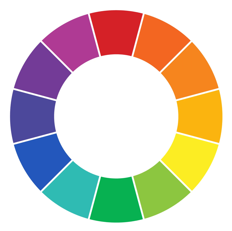
The color wheel is a visual diagram that represents the visible spectrum of light. The colors are organized into a wheel where the ‘final’ color meets again with the initial one in a strategic gradient, forming many key visual relationships throughout. Viewing colors like this makes it easy to coordinate colors in crafting as long as you know some important strategies.
Tomorrow I’ll post more on Color Coordinating Strategies!
